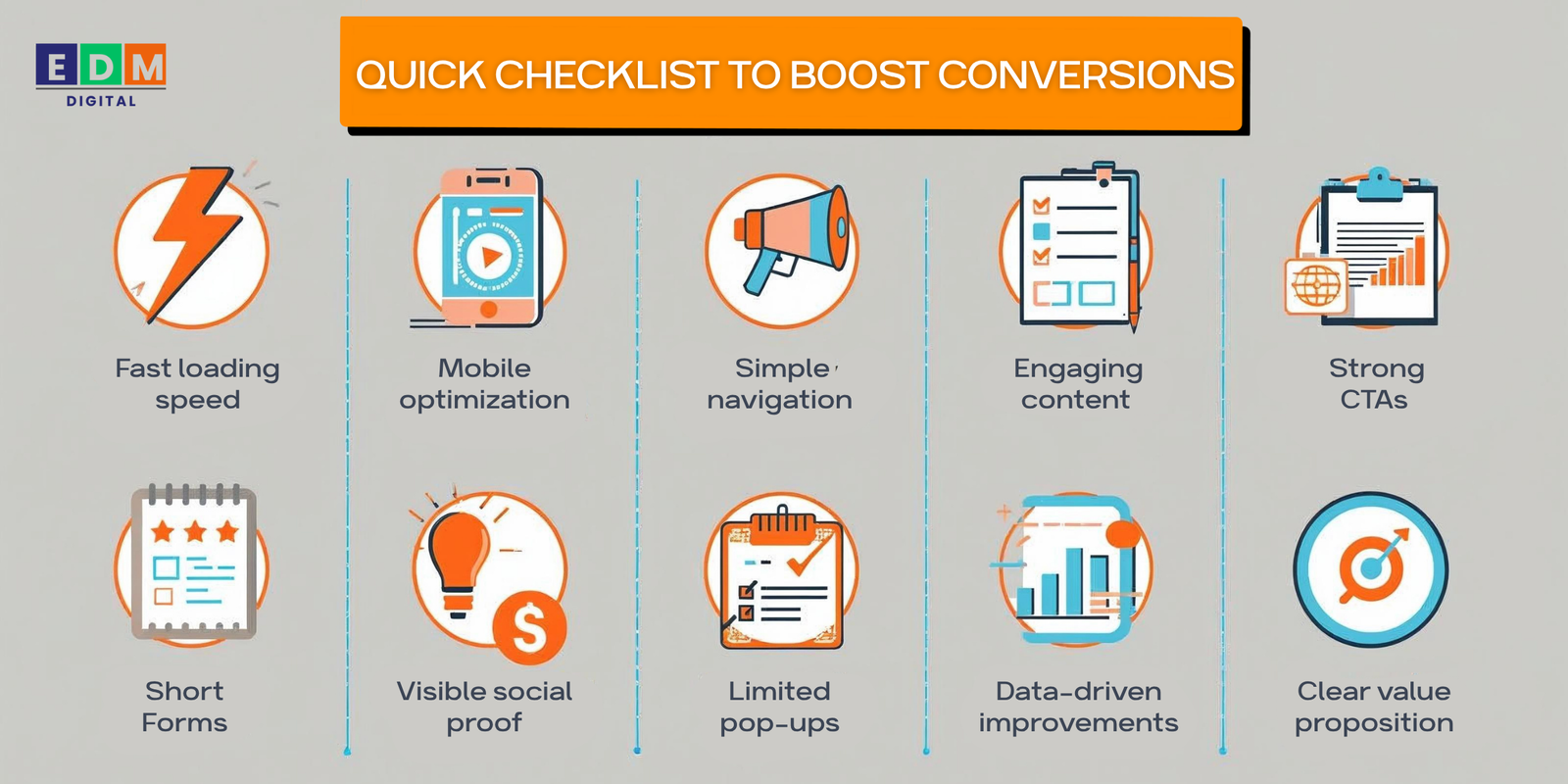
Top 10 Website Mistakes That Kill Conversions
Your website may look great, but if it isn’t converting visitors into leads or customers, something is going wrong. Many businesses unknowingly make design, content, or functionality mistakes that drive potential buyers away.
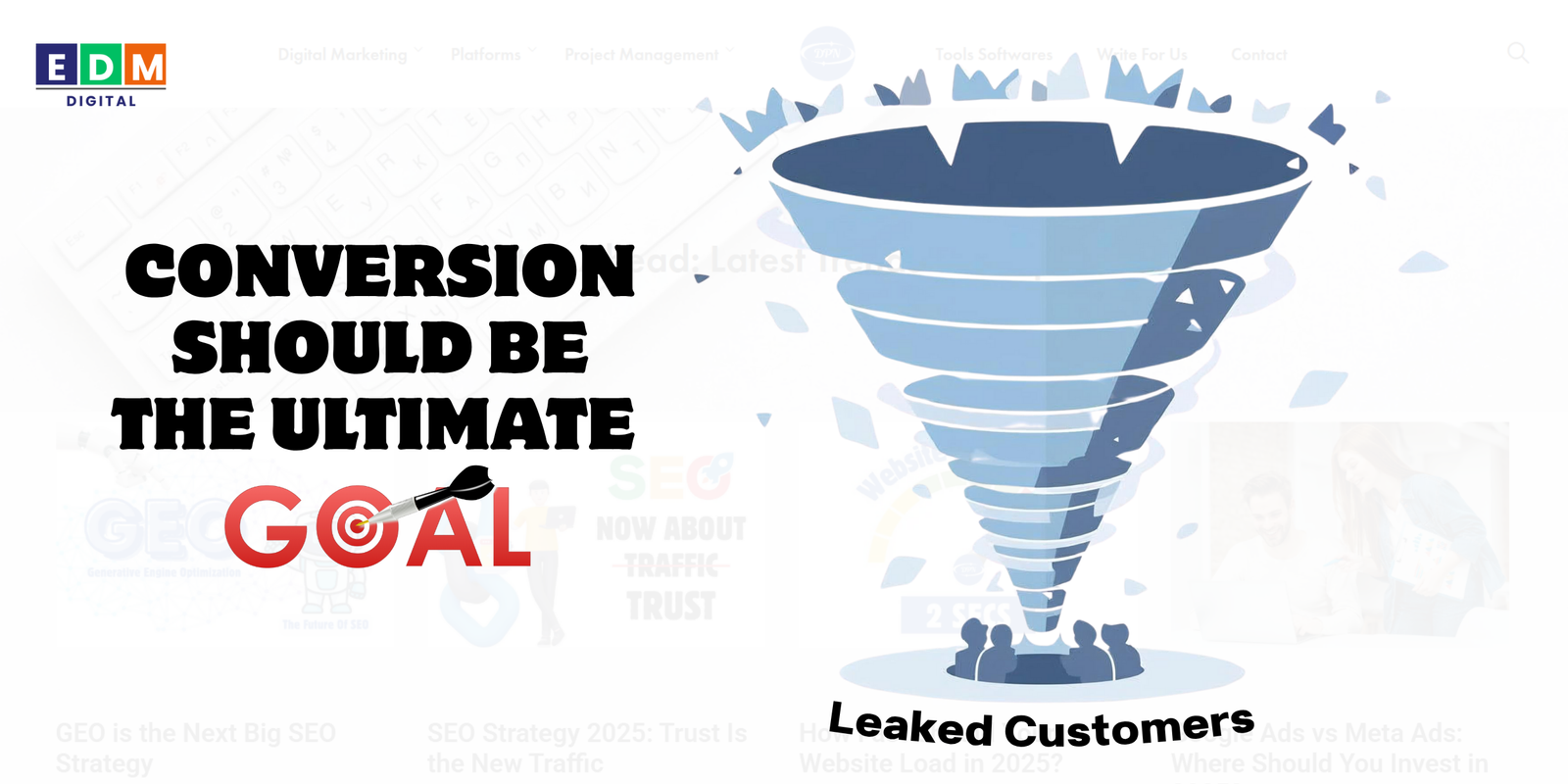
In digital marketing, conversion is the ultimate goal—whether that means generating leads, sales, or sign-ups. To maximize conversions, you must identify and fix the hidden website issues that frustrate users and block sales.
Here are the top 10 website mistakes that kill conversions—and how to fix them.
1. Slow Loading Speed
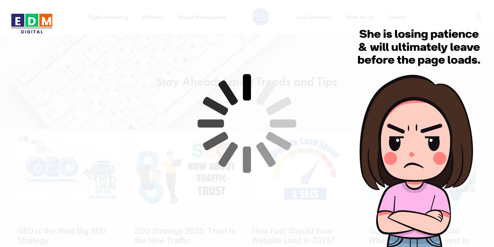
A website that takes more than a few seconds to load can drastically reduce conversions. Research shows that every second of delay decreases conversions by 7%.
Learn how fast should your website load in 2025.
Why It Hurts:
- Users lose patience and leave before the page loads.
- Search engines penalize slow sites in rankings.
Fix It:
- Optimize images and compress files.
- Use a lightweight theme and fast hosting.
- Implement caching and a content delivery network (CDN).
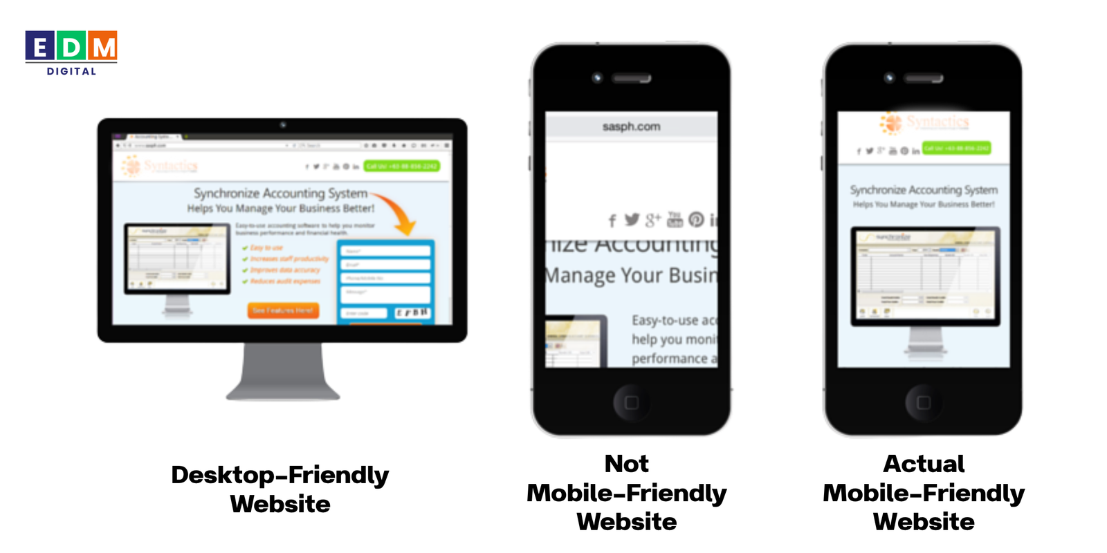
2. Poor Mobile Experience
With over 60% of traffic coming from mobile, a non-responsive website is a deal-breaker.
Why It Hurts:
- Pinching and zooming frustrates users.
- Mobile visitors abandon sites that don’t display properly.
Fix It:
- Use responsive design.
- Test across different devices and screen sizes.
- Optimize buttons and forms for thumb-friendly navigation.
3. Confusing Navigation
If users can’t find what they need quickly, they’ll leave. A cluttered menu or too many options can overwhelm visitors.
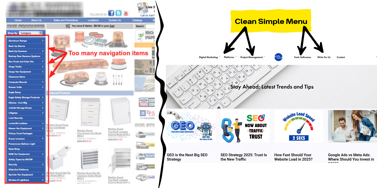
Why It Hurts: (But it won’t hurt us because you are here reading our blog. And it’s all because we had a clean & simple Navigation Menu)
- Visitors drop off instead of exploring deeper.
- Key pages (like services or pricing) get buried.
Fix It:
- Keep menus simple with clear categories.
- Add a search bar.
- Use breadcrumb navigation for clarity.
4. Weak or Missing CTAs
A call-to-action (CTA) guides visitors toward conversion. Without clear CTAs, users don’t know the next step.
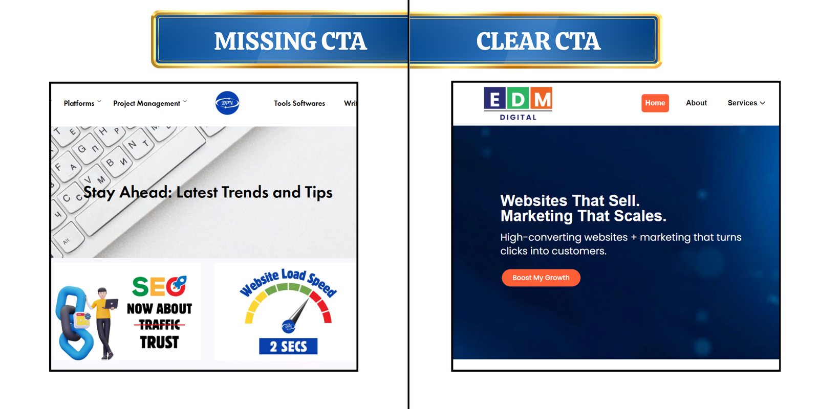
Why It Hurts:
- Visitors browse without taking action.
- Missed opportunities to capture leads or sales.
Fix It:
- Use action-driven CTAs like “Get a Free Quote” or “Start Now.”
- Place CTAs strategically (above the fold, at the end of sections).
- Test button colors, sizes, and placements.
You can check EDM Digital’s – CTA button’s – colour, size and placement for reference.
5. Overly Complicated Forms
Visitors are reluctant to fill out long or confusing forms. Asking for unnecessary details can tank conversion rates.
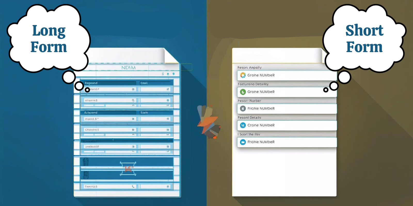
Why It Hurts:
- Longer forms = higher abandonment rates.
- Users don’t want to share too much personal info upfront.
Fix It:
- Keep forms short (name, email, phone at most).
- Use smart forms that expand as needed.
- Enable autofill for faster input.
6. Poor Quality Content
Your content should engage, inform, and persuade. This simply means you should create a conversion focused content. Outdated, generic, or poorly written content reduces credibility.
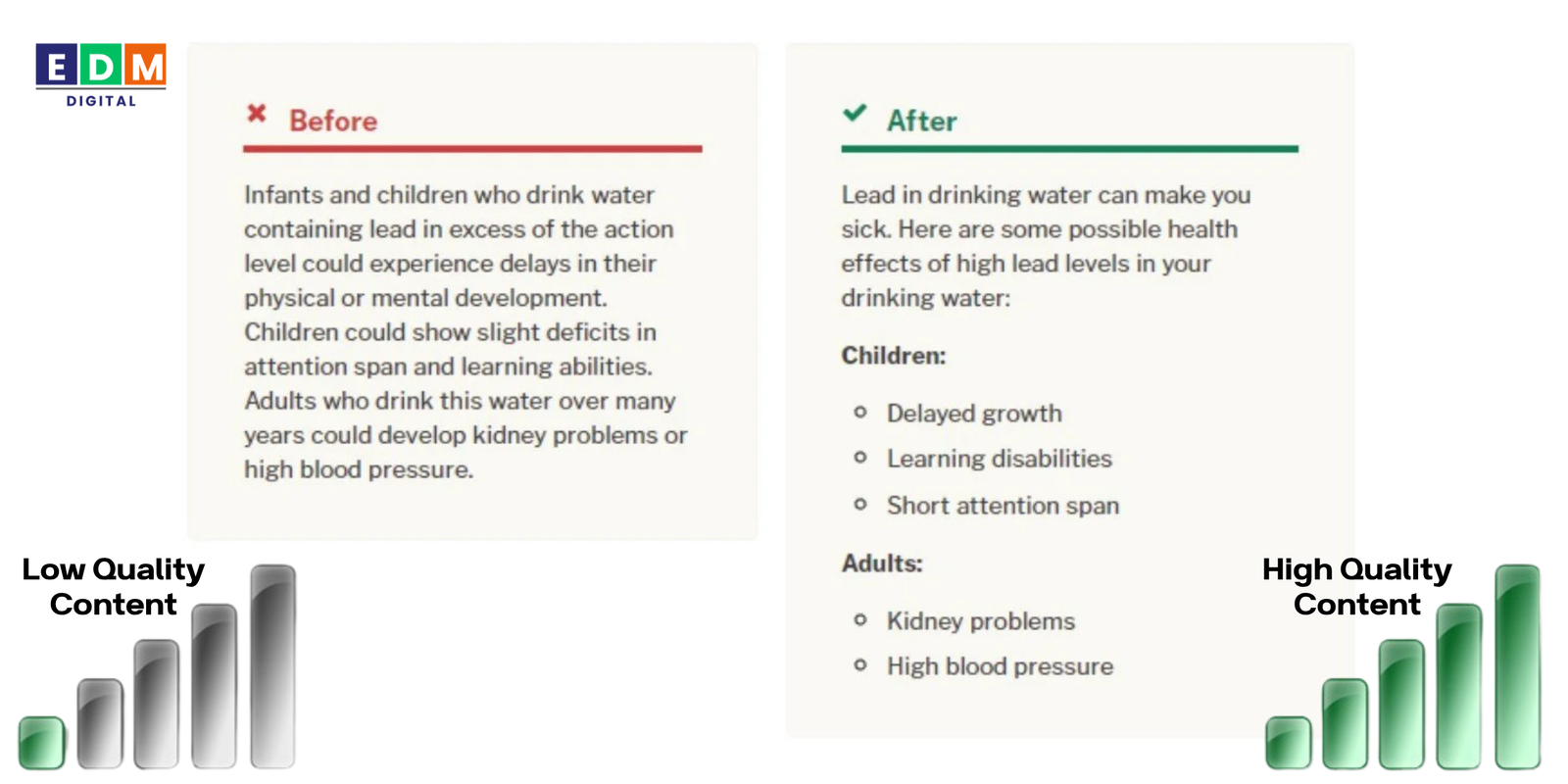
Why It Hurts:
- Visitors lose trust in your brand.
- Low-quality content hurts SEO rankings.
Fix It:
- Write clear, benefit-driven copy.
- Use headings, bullet points, and visuals for easy scanning.
- Update blogs, service pages, and FAQs regularly.
7. Lack of Social Proof
Today’s buyers rely heavily on reviews, testimonials, and case studies before making decisions. Without social proof, your brand looks less trustworthy.
Go check EDM Digital’s Social Proof on:
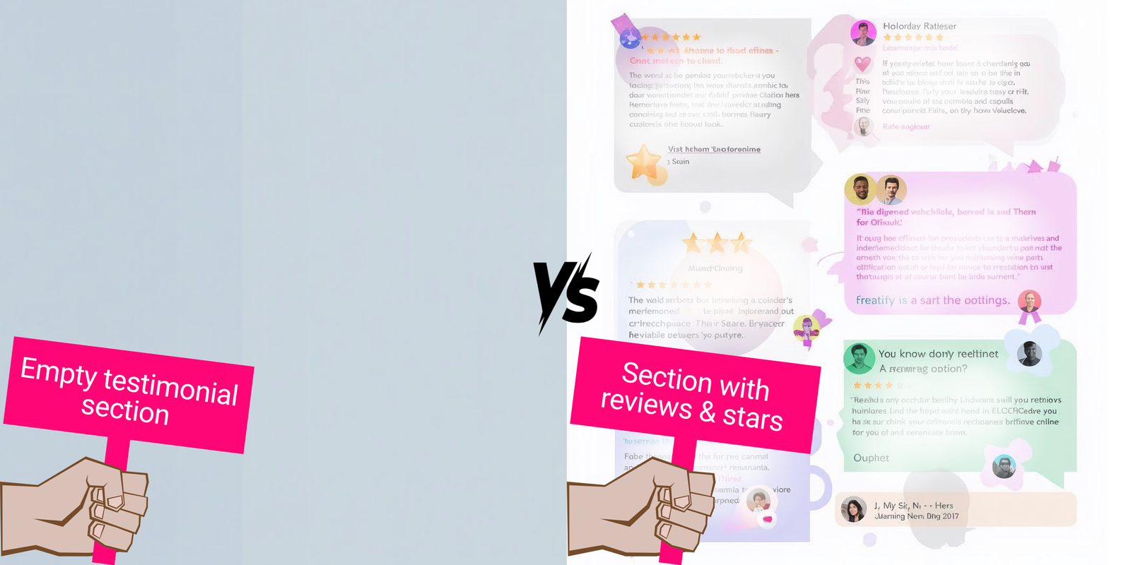
Why It Hurts:
- Users doubt your credibility.
- Competitors with stronger reviews win customers.
Fix It:
- Showcase testimonials and star ratings.
- Add logos of trusted clients or certifications.
- Use case studies to highlight results.
8. Intrusive Pop-Ups and Ads
Pop-ups can be effective, but too many—or poorly timed ones—annoy users and drive them away.
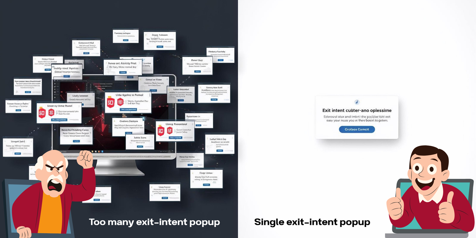
Why It Hurts:
- Visitors leave if bombarded with interruptions.
- Google penalizes sites with intrusive interstitials.
Fix It:
- Use subtle, exit-intent pop-ups.
- Limit to one or two per session.
- Offer real value (discount, free guide, newsletter).
9. Ignoring Analytics and Testing
Many businesses launch websites but never analyze performance. Without data, you’re guessing what works.
Why It Hurts:
- Missed opportunities to improve conversions.
- Blind spots in customer behavior.
Fix It:
- Set up Google Analytics and heatmaps.
- Run A/B tests on headlines, CTAs, and layouts.
- Continuously refine based on insights.
10. Unclear Value Proposition
If users don’t immediately understand why they should choose you, they’ll bounce. A strong value proposition is essential.

Why It Hurts:
- Visitors can’t tell what makes you different.
- Potential customers don’t see the benefit.
Fix It:
- Use a clear headline that communicates your unique selling point (USP).
- Highlight benefits, not just features.
- Make it visible above the fold.
How to Turn Website Mistakes into Conversions
Fixing these website mistakes doesn’t just improve user experience—it directly impacts your bottom line. A fast, user-friendly, conversion-focused website builds trust and encourages action.
Final Thoughts
Your website is more than a digital brochure—it’s your most powerful sales tool. But if you’re making these common website mistakes, you’re leaving money on the table.
By eliminating barriers, simplifying navigation, and focusing on user needs, you create a seamless experience that converts visitors into loyal customers.
Action Step: Audit your website today. Fix one mistake at a time, and watch your conversion rates rise.
Want to maximize your website’s conversion potential? Our team specializes in building high-performing websites that attract traffic and turn visitors into paying customers.
Contact us now to start boosting your sales and stopping these website mistakes.